If you spend any time around active traders, you’ll notice the same three chart types: line charts, bar charts, and candlestick charts. Each chart presents the same underlying data – price over time – but with different levels of detail.
Line charts
The line chart is the minimalist’s choice. It connects a series of prices – most commonly the closing price of each period – into a single, continuous line. By stripping away the open, the high, and the low, it removes intra-day noise and foregrounds the one number many professionals still consider paramount: the close.
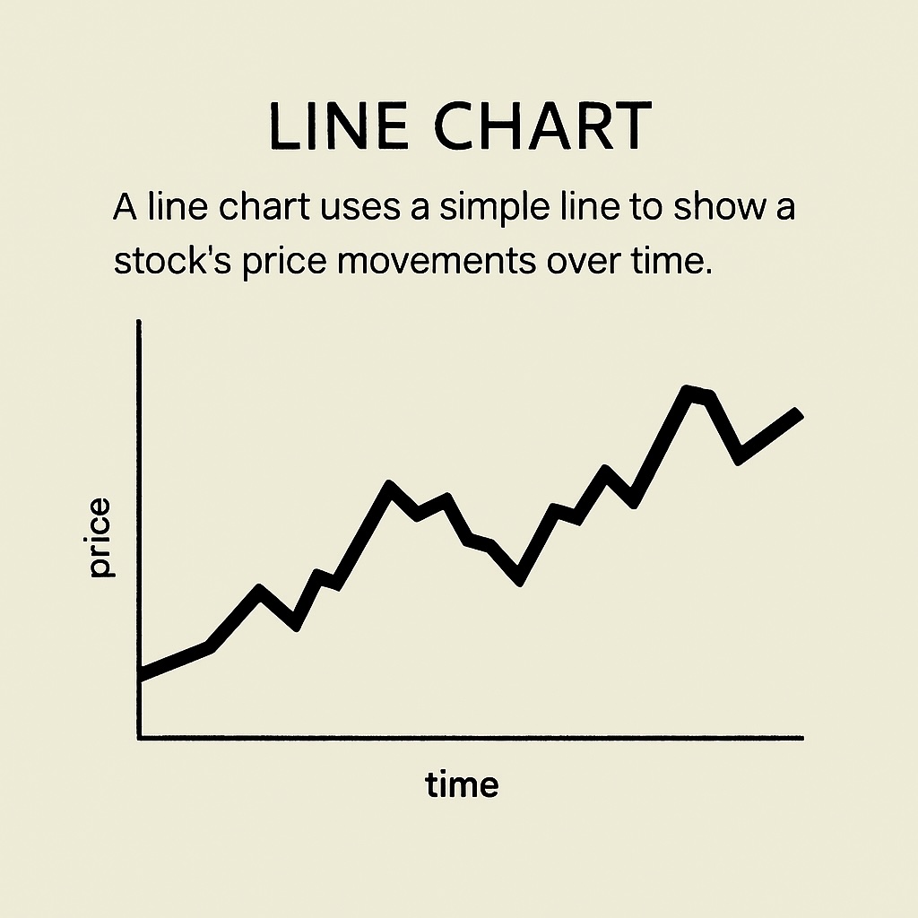
That simplicity is precisely the point. A daily or weekly line chart of a share or index will show you the dominant trend with far less clutter than other charts. Instantly, you’ll know: Is the stock going up or down, or trending sideways?
When you use a line chart, you’re looking for the big picture – the overall direction of the market or a stock – not the small, short-term moves. It helps you see whether prices are:
- Trending higher (rising over time),
- Rolling over (starting to fall after rising), or
- Drifting sideways (staying roughly the same).
A line chart is best when you’re trying to understand the general direction or mood of the market, not to pinpoint the exact moment to buy or sell.
For Australian investors running watchlists across banks, miners, healthcare, and tech, the line chart is the fastest way to scan twenty names and decide which five deserve special attention.
Bar charts
Step up to a bar chart and you’re adding back the anatomy of each trading period – the open, the high, the low, and the close. The vertical line shows the full range of prices for that period, from the day’s low at the bottom to the high at the top. The small left tick marks the opening price and the right tick marks the close.
If the close is higher than the open, the bar is usually shown in green, meaning price rose during that period. If it’s lower, it’s shown in red, meaning price fell. The height of the bar represents how wide the price range was – tall bars mean large swings (high volatility), while shorter bars mean the market was more stable (lower volatility).
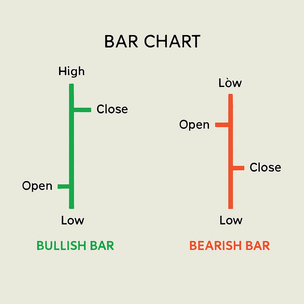
By glancing across a series of bars, you can see whether volatility is increasing (bars becoming taller) or volatility is decreasing (bars growing shorter).
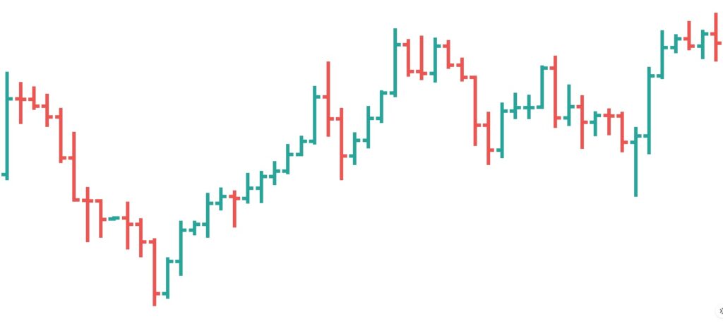
As you can see in the bar chart above, the highest volatility usually happens around when the price changes direction – when an uptrend turns down or a downtrend turns up. That’s because at turning points, sellers are taking profits as buyers are entering new positions – and this tug-of-war causes wide-range bars. Once a new direction is confirmed, volatility often settles temporarily.
Candlestick charts
Candlestick charts don’t offer any more information than bar charts – they just display the information differently. The candle’s body maps the open-to-close range; the wicks show the extremes; the colour communicates whether bulls (rising prices) or bears (falling prices) won the period.
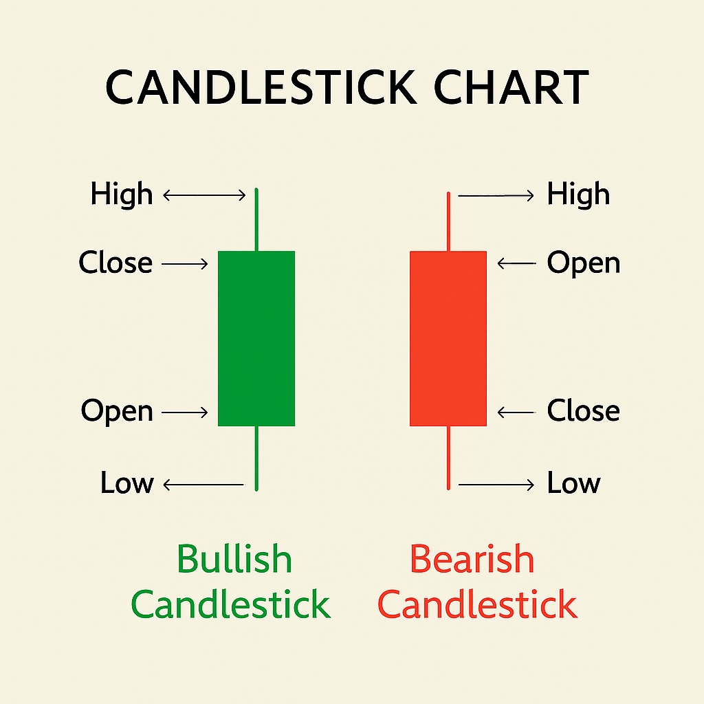
A candlestick chart captures the emotional rhythm of the market – each candle representing one trading period and highlighting four key prices: the open, high, low, and close. The body of the candle (the rectangle) spans from the open to the close; the thin lines above and below – called wicks or shadows – show how far prices stretched during the session.
Colour is what makes candlestick charts instantly readable. A green (or sometimes white) candle forms when the price closes higher than it opened – buyers were in control. A red (or black) candle forms when the close is below the open, showing that sellers dominated. The length of the candle’s body reflects the strength of that move:
- Long green candles suggest powerful upward momentum.
- Long red candles signal aggressive selling or panic – the price fell sharply, often with little resistance.
- Short candles imply indecision or balance between both sides.
When the open and close are almost the same, the candle turns into a thin cross known as a doji. It represents a market at equilibrium – neither bulls nor bears could take control. A doji doesn’t predict direction on its own, but it warns that sentiment may be shifting.
While bar charts contain the same information, candlesticks convey it more intuitively. They highlight when momentum builds, stalls, or reverses. A cluster of long candles, for instance, shows rising volatility; alternating colours reveal tug-of-war trading; and a sudden oversized red candle after a steady climb often marks a turning point.
In essence, candlestick charts translate raw numbers into a visual language – a fast, emotional map of who’s winning each round in the market.
